![Intuitive logo RGB-1.png]](https://help.intuitivebusinessintelligence.com/hs-fs/hubfs/Intuitive%20logo%20RGB-1.png?height=40&name=Intuitive%20logo%20RGB-1.png)
Default Image Changes
We'll first start with changing the default images that are shipped with the Intuitive Dashboards.
An alternative logo can be set on the left-hand side of the dashboard, where by default it will be "Intuitive".
To make this change, firstly stop the Intuitive Dashboard Service via Services.
Then, replace the "customerlogo.png" file in the below directory with the logo of your choice:
C:\Program Files\Intuitive Business Intelligence\Intuitive Dashboards\Client\Images
We recommend that the height is set to 80px, but larger logos will be scaled to fit.
Finally, start the dashboard service back again and ensure that the logo has now been changed.
Should you find that the logo has not changed, clear your browser cache and reload the page.
The next area we can change is the welcome message. You'll need to ensure that before making any changes in the config file, that the Intuitive Dashboard service has stopped.
By default, users will be presented with a message similar to the below:

It's possible to alter this message, and to do so open "dashboard.config" located (by default) in the below directory:
C:\Program Files\Intuitive Business Intelligence\Intuitive Dashboards\Server
On line 95, you can alter the value field for "WelcomeMessage" for your own custom message. For example, to change it from "Welcome {UserName} to the {InstallationName} Home Page" to "Welcome {UserName} to your {InstallationName}", you need only make the following alterations:

However, should you wish to change the value "InstallationName" contains and / or its associated formatting, you can alter its value on line 89:

At this point, you can start the Intuitive Dashboard service. However, in this same file (Dashboard.config) we can also make the colour scheme changes.
Header Change
When changing the colour of the header, you can either set it as a static colour or add two colours to create a gradient.
Regardless of which option you choose, they both need to be performed in the same way.
Navigating to line 110, you can see there's two values we can change here, the "Upper" and the "Lower". By default, these values are the same, and give the dashboards the blue colour, as shown below:


We can therefore change this colour to be another static colour. To generate the colour of your choice, you first need to provide the hex number of the colour you'd like. For example, for the colour red you can use "FF0000". Afterwards, you need to prepend two characters onto the front which represents the "Alpha", which is the transparency of the colour.
By prepending "FF" (highlighted in bold) onto our hex number to make it fully opaque, we give ourselves the value of "FFFF0000".
Conversely, should you wish it to be fully transparent, you can use "00" instead, to give you "00000000". The below output is of the former opaque colour:


To create a gradient, we only need to provide two different colour in each of these "Upper" or "Lower" fields.
"Upper" represents the colour from the top, blending downwards, with "Lower" the colour at the bottom blending upwards into the upper colour.
For this example, I've selected two contrasting colours to illustrate this, "FFF56EFA" and "FF06FF00" with the below output:

As before, if this is the only change you need to make, you can save the config file and start the Intuitive Dashboard service. However, the next changes we'll be making is to the palette colour choices.
Palette Colours
Moving to the section starting on line 124 I can change the palette colours used by the dashboard components
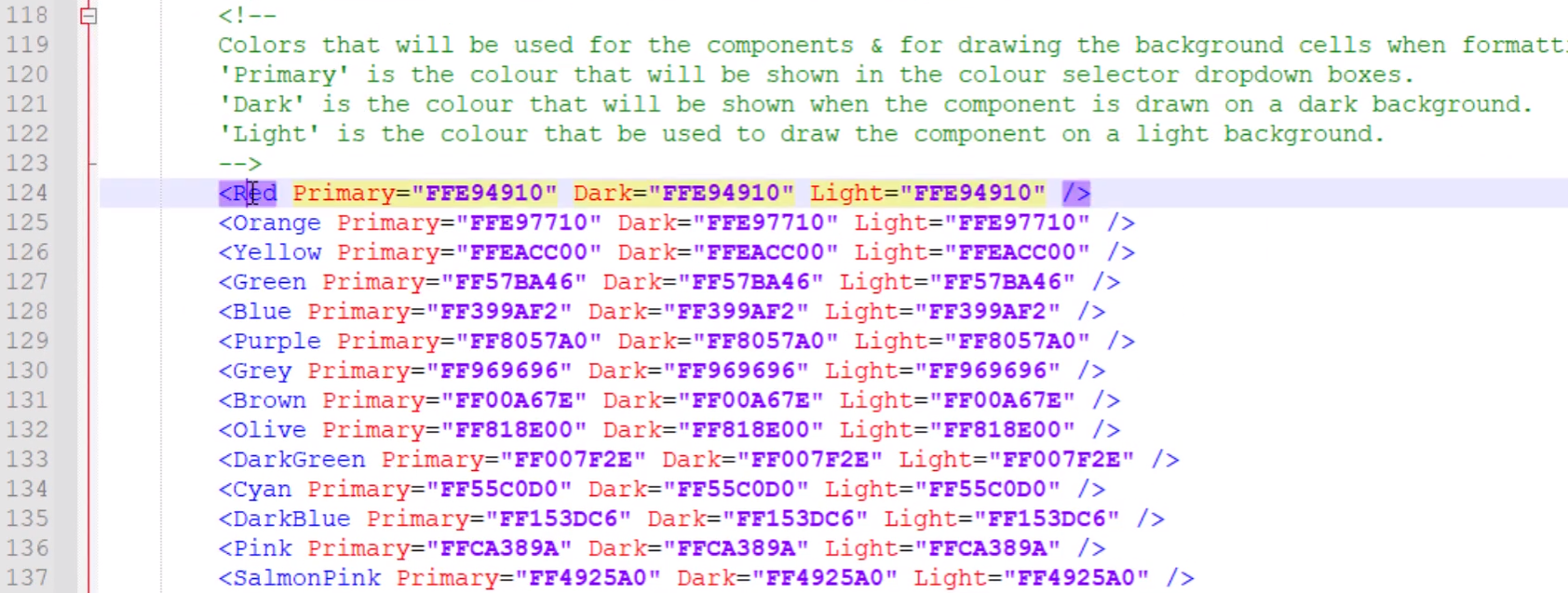
In any of these colour variables, you can alter the hex code used. Any colour can be used, for example for red, we could set this to be pink with the code FFFF00EF to be used in all three fields Primary, Dark and Light
- Primary is the colour that is displayed when picking a colour within the component properties, it’s that drop down box where you select a colour
- Dark is the colour that is displayed when you view the component in the dark theme
- Light is the colour that is displayed when you view the component in the light theme

For reference, you can change themes within the main menu, it’s under colour scheme

You may want to revise your colour choices based on these backgrounds, for example, my pink may not look good on dark backgrounds, so I’ll make it a bit darker and easier on the eyes with FFDE00D1 and use that in the dark field

As we've made the last I’ll save the file now, and start the Intuitive Dashboard service