From V3 of the Intuitive for PaperCut dashboards, each dashboard includes a QR code in the bottom left of the dashboard. Clicking this icon, or scanning with a QR tool on a device takes you to an informative how-to video for operating that dashboard.

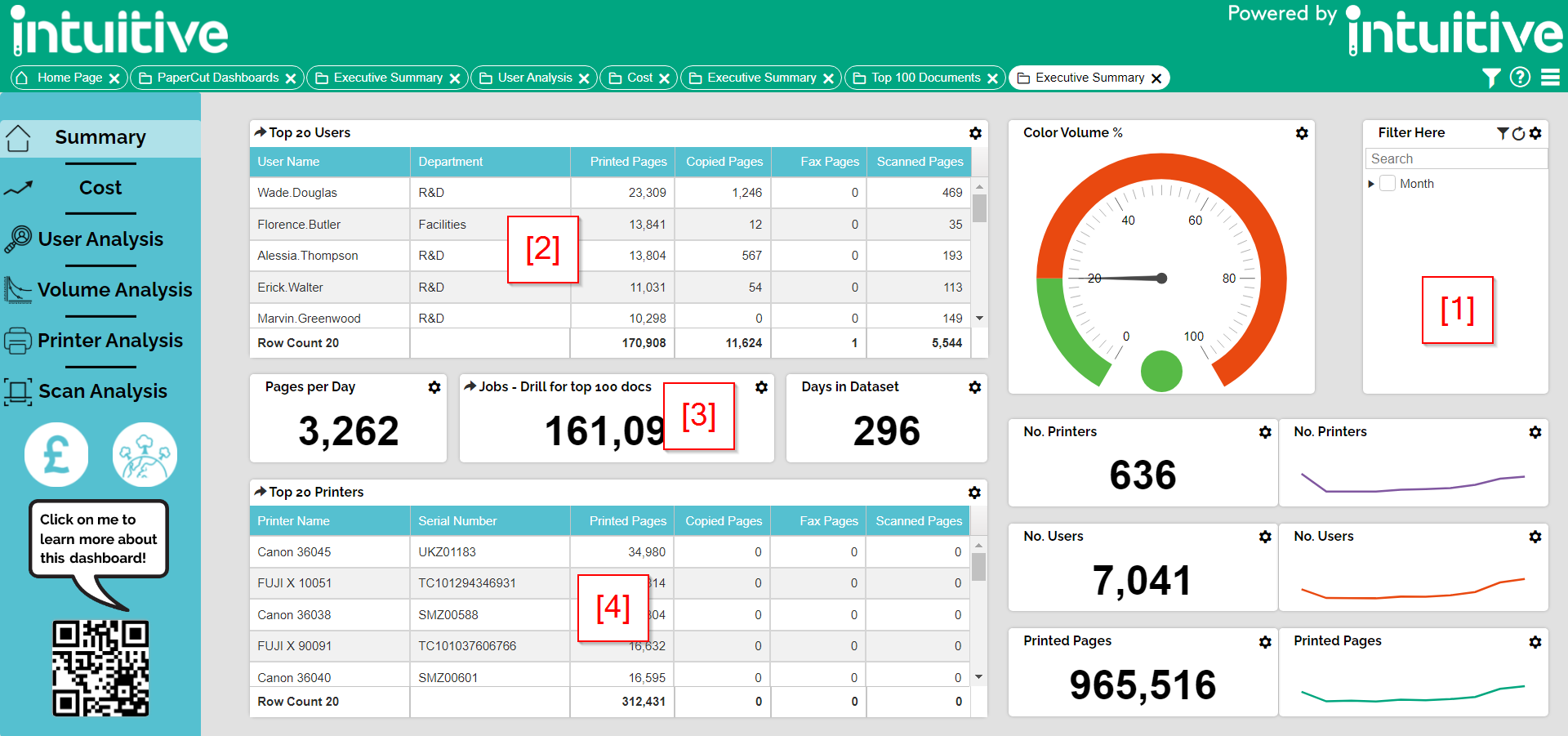
Executive Summary
The Executive Summary dashboard gives an annual summary of all print and copy activity across your print estate.
The filter component [1] is in the top right and allows you to easily filter by Month.
Drilling down a month on component [2] reveals the Top 20 Users overall.
Drilling down a month on component [3] reveals the Top 100 Printed Documents overall.
Drilling down a month on component [4] reveals the Top 20 Printers overall.
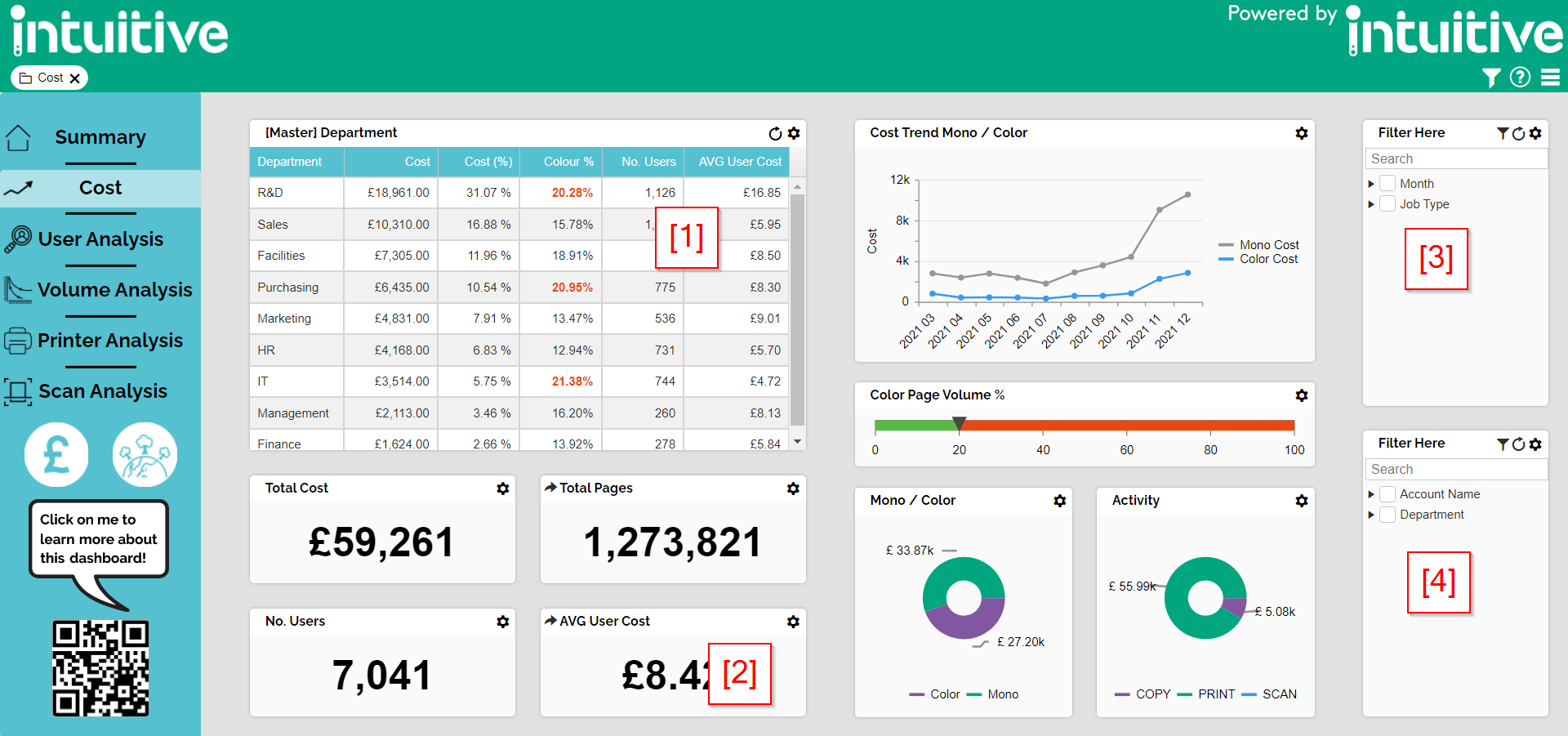
Cost
The Cost dashboard gives an annual summary of all costs across your estate including Print, Copy and Scan.
The master component [1] is in the top left and allows you to easily filter by department.
Drilling down on component [2] opens the User Analysis dashboard. If a department is selected it carries this filter to the next dashboard
The filter component [3] is in the bottom right and allows you to filter by Month & Job Type.
The filter component [4] is in the top right and allows you to easily filter by User Detail.
User analysis
The User Analysis dashboard collects data for the top 500 users overall in your organisation. However, by editing the User Statistics component, you can either extend or remove this limit.
The filter component [1] is in the top right and allows you to easily filter by User Detail.
The filter component [2] is in the bottom right and allows you to easily filter by Month & Job Type.
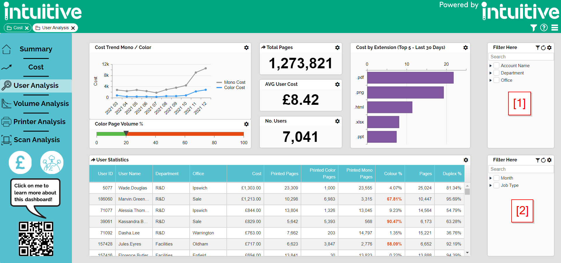
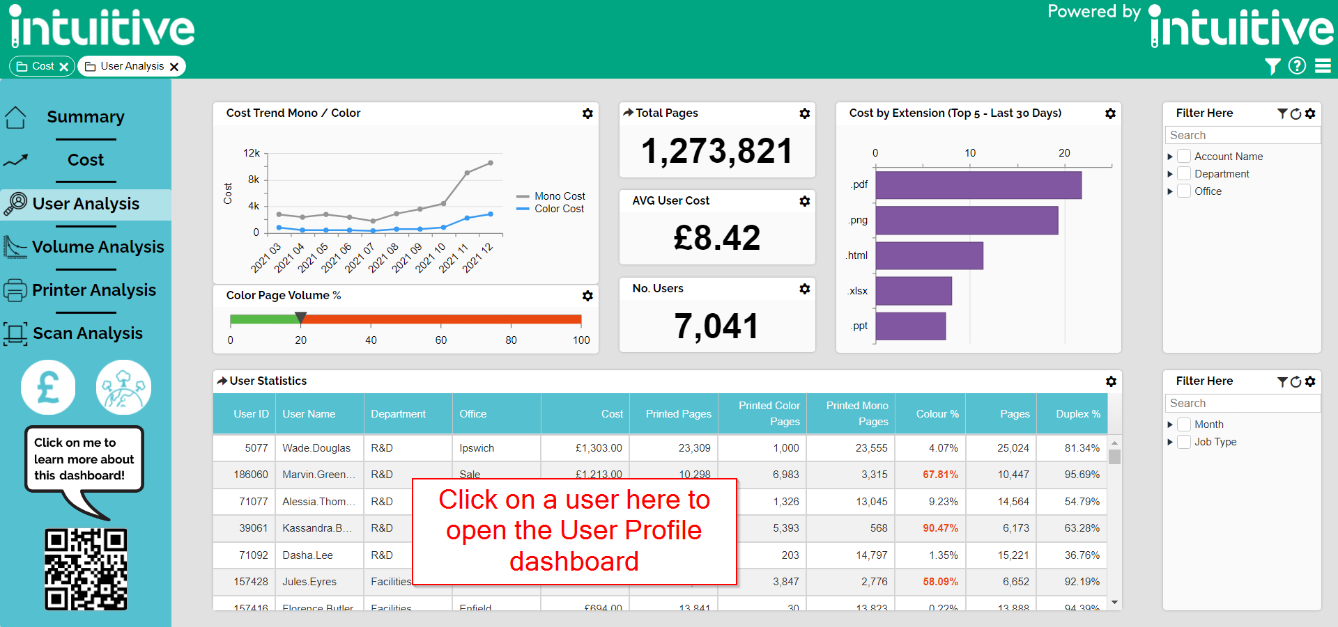
As a default, the user analysis dashboard can be used to open a profile for each of the top users.
Tip. Clicking on the column headers of a grid will sort by that measure/attribute. Each click reverses the order of sort.
Once the user profile dashboard is open, click on the number of jobs to open a list of everything printed by this user over the last 30 days
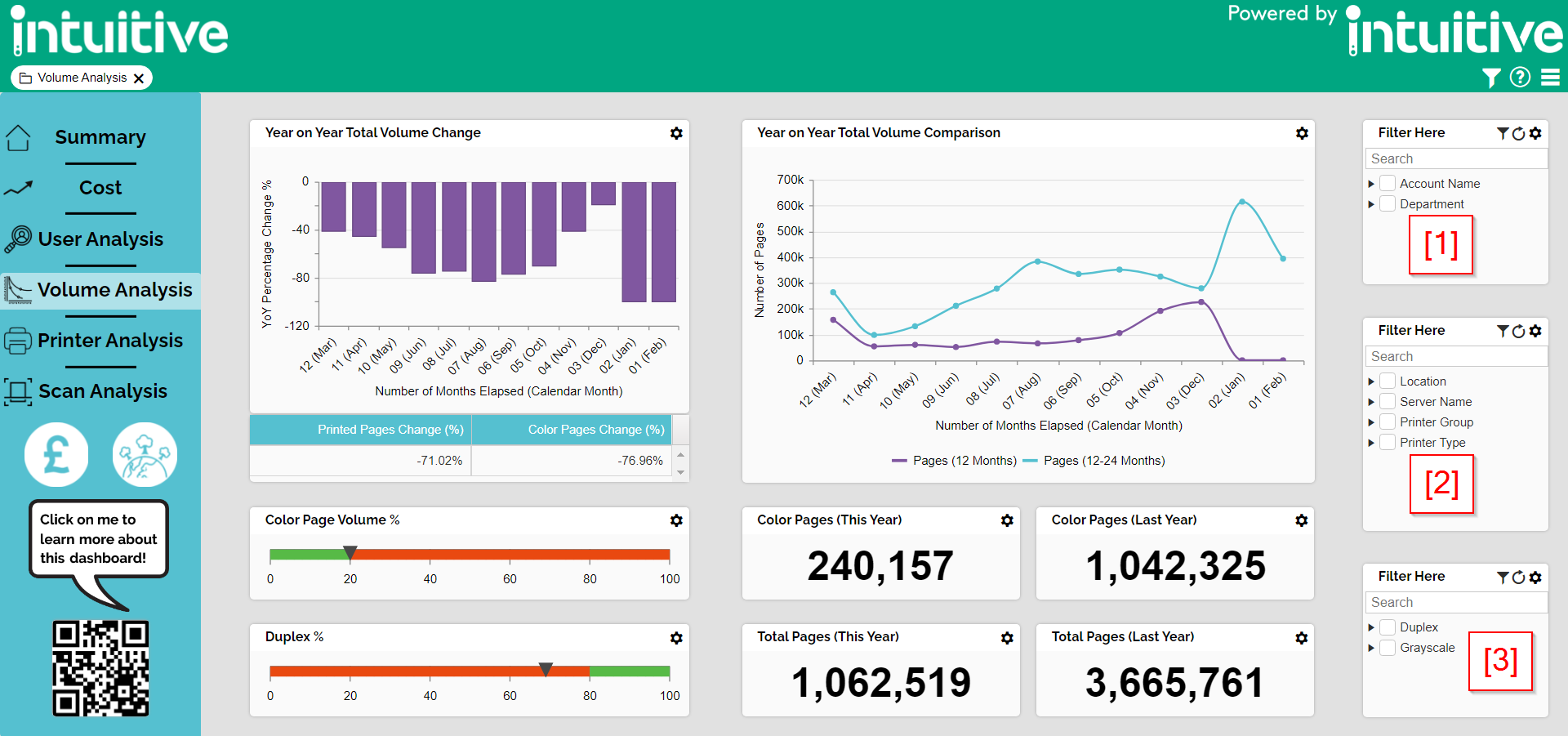
Volume Analysis
The Volume Analysis dashboard allows you to see a rolling 24 month output of your printing volumes.
The filter component [1] is in the top right and allows you to easily filter by User Detail.
The filter component [2] is in the middle right and allows you to easily filter by Printer Detail.
The filter component [3] is in the bottom right and allows you to easily filter by Duplex & Grayscale.
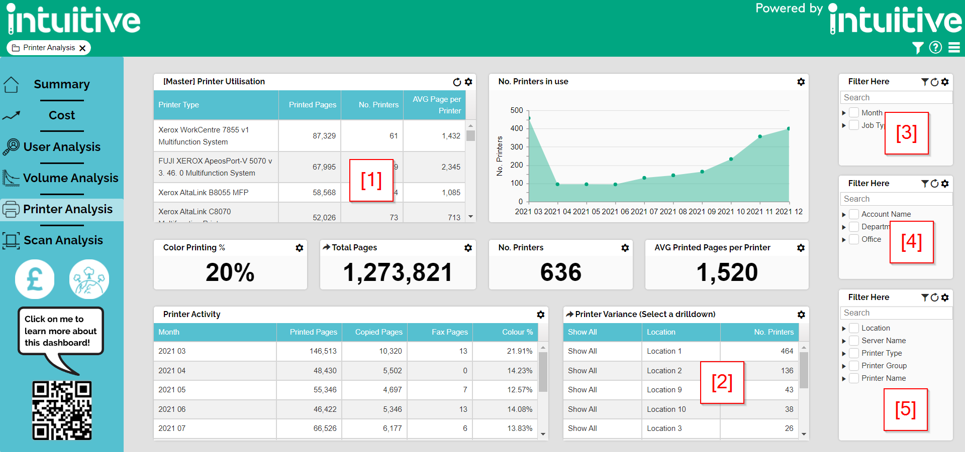
Printer Analysis
The Printer Analysis dashboard allows you to see a summary of Printer activity.
Select a device from the Master component [1] to view a summary in the other dashboard components.
Selecting the drilldown [2] allows you to see the printer variance across your estate. Selecting one of the options, such as Location, allows you to see which printers are either under or overperforming based on their printed volumes. This would then allow you to identify printers for users to start using more.
The filter component [3] is in the top right and allows you to easily filter by Month & Job Type.
The filter component [4] is in the middle right and allows you to easily filter by User Detail
The filter component [5] is in the bottom right and allows you to easily filter by Printer Detail.
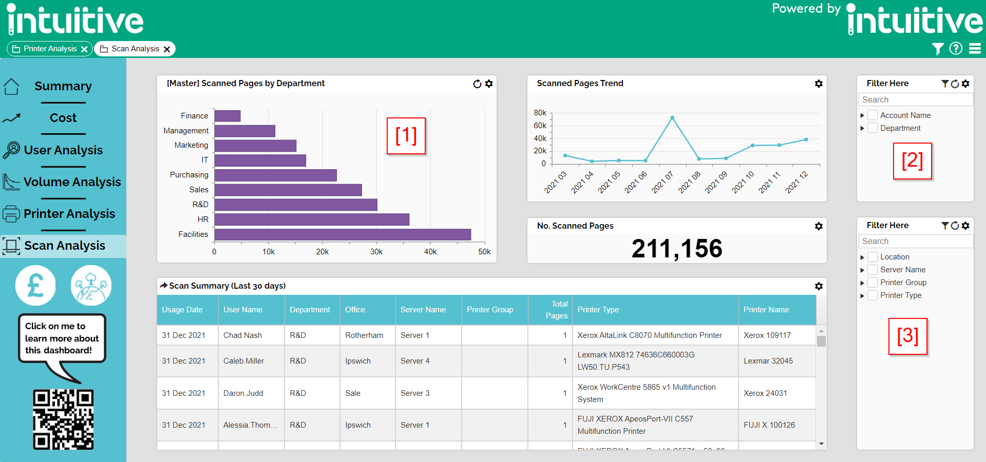
Scan Summary
The scan summary dashboard only shows scan activity, allowing you to view it in isolation from other device activity.
Select a department from the Master component [1] to see which users are scanning the most and which devices they are using.
The filter component [2] is in the middle right and allows you to easily filter by User Detail
The filter component [3] is in the bottom right and allows you to easily filter by Printer Detail.
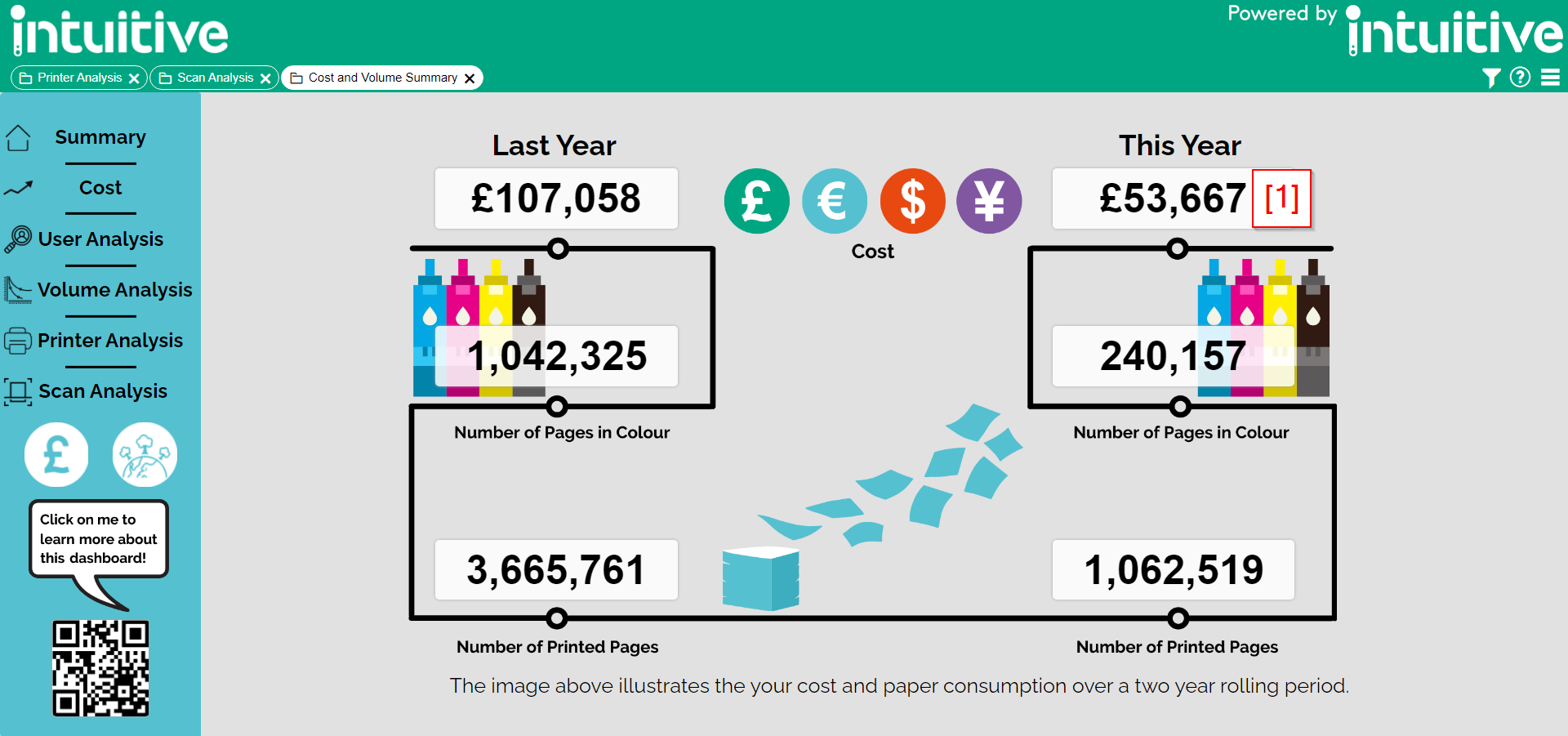
Cost and Volume Summary Dashboard
The Cost and Volume Summary dashboard captures the total cost and volumes of printed pages over a rolling 24 month period.
Each component allows you to drill further into departmental cost / volumes. For example, clicking the gauge [1] below allows us to see the total costs from the last 12 months.

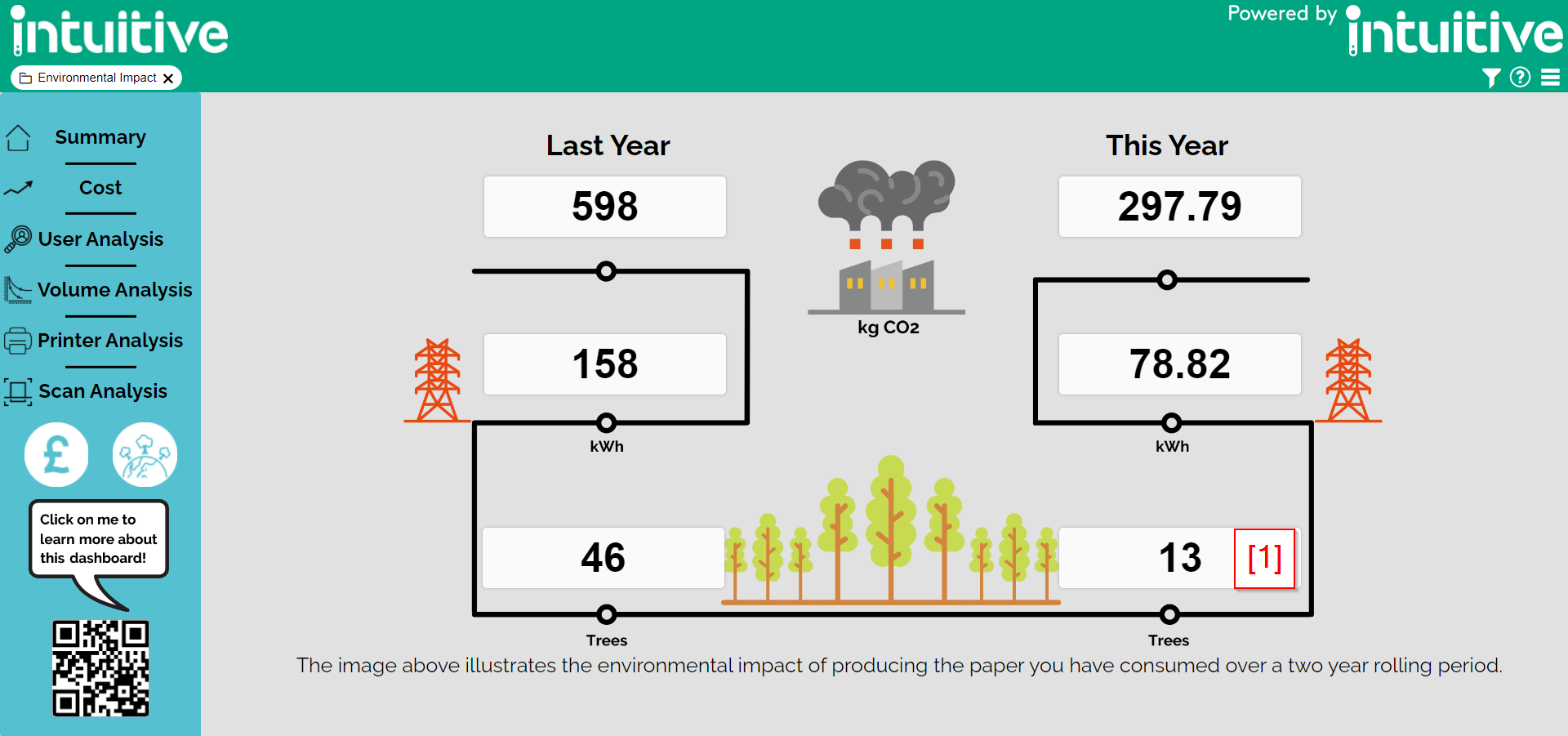
Environmental Impact Dashboard
The environmental dashboard records the environmental impact of printing in your organisation over a rolling 24 month period.
This dashboard is commonly shared around the organisation and can also be incorporated into displays.
Each component allows you to drill further into departmental environmental costs. For example, clicking the gauge [1] below allows us to see the total Trees consumed for your paper from the last 12 months.

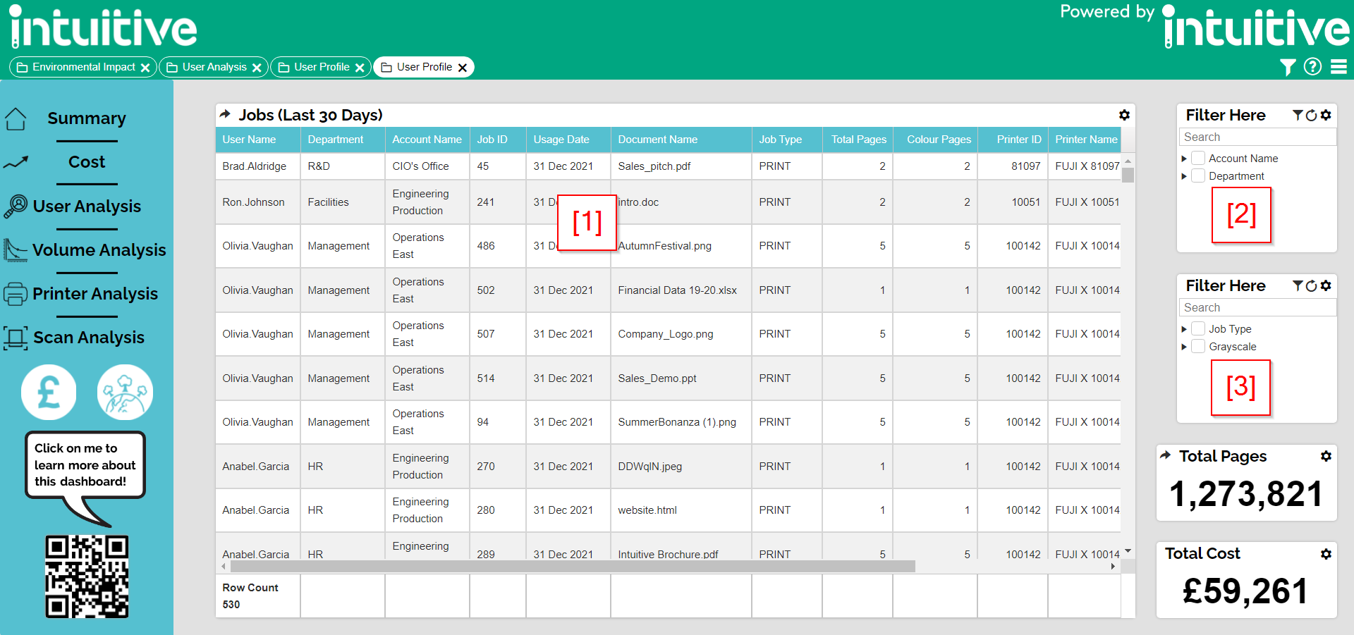
User Profile Dashboard
The User Profile dashboard store the details of all print jobs produced over the last 30 days (as standard)
Selecting the main grid component [1] from the dashboard allows you filter further into document printing habits.
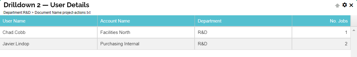
For example, selecting the department R&D allows us to see the documents that this department has printed over the last 30 days. Drilling into this further, we can select the top document, which in this instance is "project-actions.txt" which has been printed 3 times.

We can now click this document and see the users that have printed it, the account they have charged it to, their department and the number of times that document has been printed.

The filter component [2] is in the top right and allows you to easily filter by User Detail.
The filter component [3] is in the middle right and allows you to easily filter by Job Type & Grayscale.