![Intuitive logo RGB-1.png]](https://help.intuitivebusinessintelligence.com/hs-fs/hubfs/Intuitive%20logo%20RGB-1.png?height=40&name=Intuitive%20logo%20RGB-1.png)
Grid components are created using a variation on the steps described in Creating components.
To create a grid component:
1 Before creating a component, ensure that a dataset has been created by the System Designer or Administrator and published to you.
2 Create a new component which will open the Component Builder.
3 Select a dataset which will form the source data the component is based on.
4 Select the component type. For all components the default is Chart so this step is essential to create an alternative component.
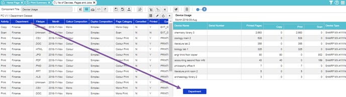
5 Select dataset columns for the component. For Grid components, drag-and-drop as many blue attribute columns and red measure columns as you require. A green pivot column can also be added to the grid (one only though).
6 Add filters
 to the component, limiting the range of data displayed in the grid.
7 It is also possible to Define grid display options.
8 Preview the Grid background colour, if required. The results of this step will not be saved.
9 Resize a component to best display the information in a component. This can be altered on a dashboard.
10 Add drilldown components, if required.
11 Define a title for the grid component.
12 Save the grid component.
13 Publish and close the grid component to allow others to view and use the component you have just created.